This article aims at explaining our first steps with the new Unity's UI Toolkit package, which is currently in preview. It exists alongside the original Unity UI as well as ImGUI, so the user can choose which system works the best for their use case. For a detailed comparison between all three, I recommend reading the official documentation. For us and our first big game, the UI Toolkit was a clear winner! The main advantage we see is the ability to develop UI in a very similar fashion as it is done in the world of web development - with markup and styling languages, separation of the structure, visage, and logic, and with the use of layouting frameworks like Flexbox.
However, as the solution is fairly new and not yet fully out, the guides out there are lacking. It is also not helping that the system was renamed (formerly UI Elements), and all the names together with the original systems sound kind of similar. Then there is the UI Builder, also a preview package, which provides an interface to build user interfaces with an easy and intuitive drag & drop solution, but which you don't have to use, as you can just create everything from code. To complicate things a bit more, the usage is also different based on if you are creating a UI for runtime, or if you are extending the Unity Editor.
The setup which we are using in the game and which I will try to explain in this article is the following:
- Unity version 2020.1.6
- UI Toolkit package 1.0.0 preview 8
- UI Builder preview 1.0.0 preview 6
- We are building UI for runtime (it will be shown while playing the game)
So let's get started!
First, we need to add those two packages. It can be done via Unity built-in package manager, either finding them in the list or adding them via a URL:
- com.unity.ui (for the UI Toolkit)
- com.unity.ui.builder (for the UI Builder)
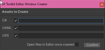
In order to start, we need 2 types of files: one for our structure (the .UXML file), and the other one for our styles (the .USS file). You will probably also need a third file - C# script to handle the logic of the UI, e.g. registering callbacks for the buttons or changing and reading information from the UI - but we will get to it in a minute. First, we need to create the files, right-click in your project and go Create -> UI Toolkit -> Editor Window. You will see a prompt where you can name all 3 files and then click to create them.
We will not use the C# script (it is meant for Editor UI), but it is a good example to see how to then load the UI to the game via code - more about it later.
Now we can open the window for UI Builder (Windows -> UI Toolkit -> UI Builder) and load the files via File -> Open (for the .UXML) and Add existing USS for the USS.
Now, in order to get a runtime UI as a screen overlay for our game (UI Toolkit doesn't support world space UI yet - that is for example an icon which would appear next to an NPC and would be moving along with it), we need to do these 3 steps:
- Create the UI in the UI Builder
- Display the UI in the game
- Setup the logic in the C# script
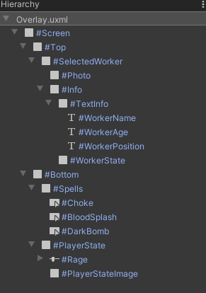
When creating the UI in the UI Builder, you are choosing elements from the library and you are organizing them in the hierarchy. Do not be confused with the Unity hierarchy, this doesn't have anything to do with it! It is just a visual representation of the underlying UXML document, which has a tree structure. For our game, we created this structure:
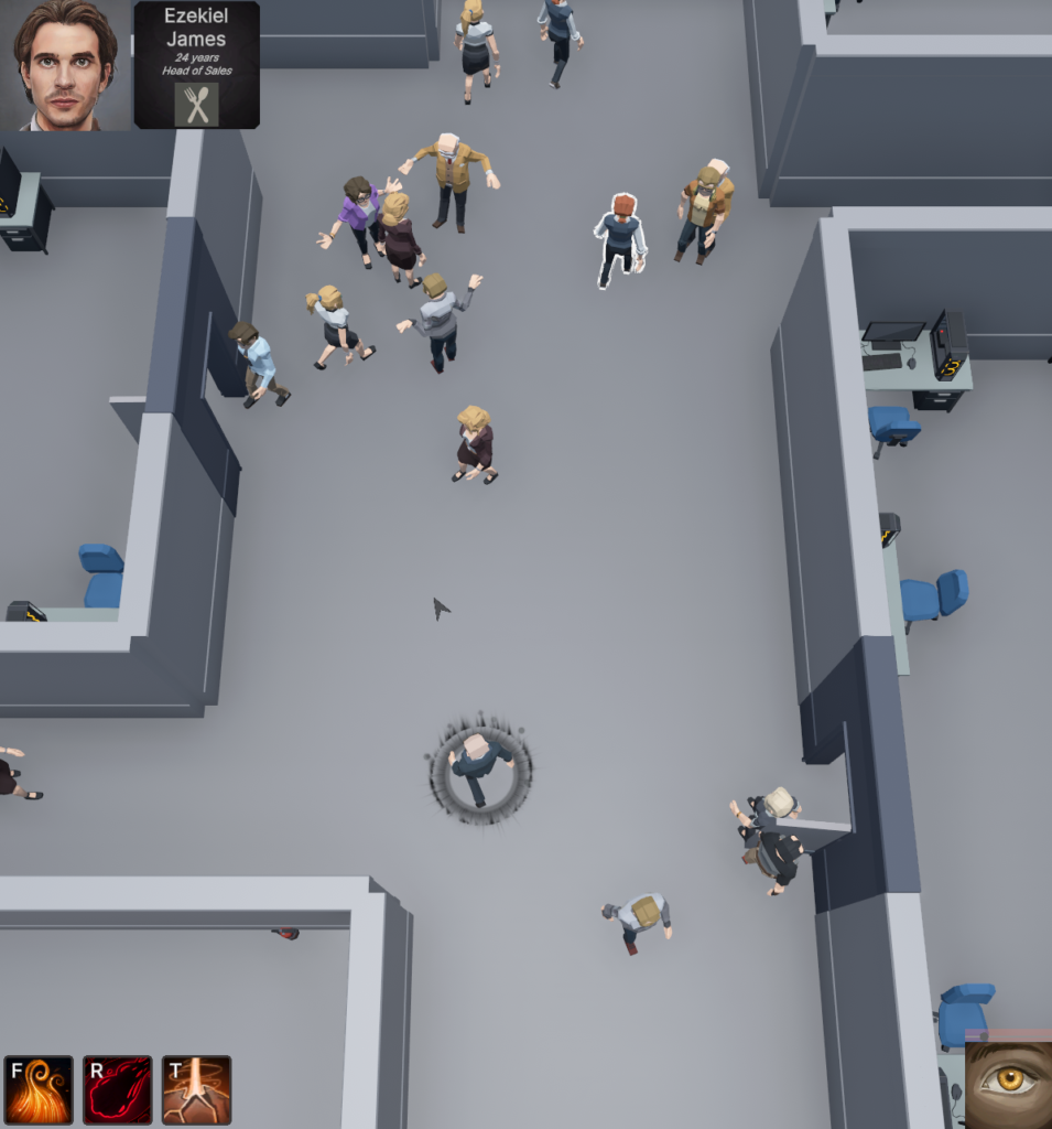
Which corresponds to this UI:
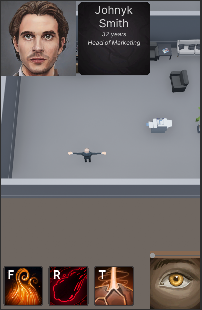
You can see the screen is divided into 2 parts - top and bottom. The top part has a photo of a selected office worker and then some info, which in turn consists of various text information. The bottom part has icons for spells, and then an icon and a slider for player status - the so-called rage.
The structure is done only using three kinds of elements: visual elements, labels, and buttons. Labels are the text info about the worker - they are just what they are named - labels. Buttons are actually the spells because they are clickable. The rest of the images are visual elements. You can think about visual elements as divs in web development. They are the default, most generic elements. We can use them as containers, but we can also use them just to display something.
P.S. The image of the game in the background? That is just a handy tip, if you click at the name of the UXML file (in my case it is Overlay.uxml), then you can set the background as an output of the camera!).
Ok, we have the structure, but the UI from the screenshot is also already styled. I won't explain how to do that as there are plenty of resources online about CSS (and USS is a subset of it). I will just say that you can either style individual elements from the hierarchy, or you can create classes and assign them. The best tutorial about how to work with UI Builder, in general, is this video from Unity themselves - Building UI for games with the new UI Builder - Unite Copenhagen. My example translates to the following USS (don't get me wrong, I didn't write the code. I clicked and set up the individual styles in the UI Builder, but this is the output file):
Label {
  font-size: 20px;
  -unity-font-style: bold;
  color: rgb(68, 138, 255);
}

.spell_button {
  position: relative;
  left: 0;
  bottom: 0;
  width: 80px;
  height: 80px;
  top: 0;
  right: 0;
  background-color: rgb(255, 255, 255);
  color: rgb(255, 255, 255);
  -unity-text-align: upper-left;
  font-size: 22px;
  margin-left: 5px;
  margin-right: 5px;
  margin-top: 5px;
  margin-bottom: 5px;
}

.spell_button:hover {
  border-left-color: rgb(100, 109, 128);
  border-right-color: rgb(100, 109, 128);
  border-top-color: rgb(100, 109, 128);
  border-bottom-color: rgb(100, 109, 128);
}

.spell_button:active {
  background-color: rgba(255, 255, 255, 0);
  opacity: 0.85;
}

.spells {
  flex-direction: row;
  align-items: flex-end;
}

.player_stats {
  align-items: center;
}

.rage_player_state {
  background-image: url("/Assets/UI Toolkit/Icons/Assassinskill_44.png");
}

.normal_player_state {
  background-image: url("/Assets/UI Toolkit/Icons/Druideskill_48.png");
}

.alignment_player_state {
  background-image: url("/Assets/UI Toolkit/Icons/Druideskill_17.png");
}

.spell_button_inactive {
  -unity-background-image-tint-color: rgb(43, 43, 43);
}

.hide {
  display: none;
  opacity: 1;
}

.worker_text_info {
  color: rgb(214, 214, 214);
  font-size: 12px;
  -unity-font-style: italic;
  white-space: normal;
}

.info_panel {
  background-image: url("/Assets/UI Toolkit/bg_grey.png");
  flex-grow: 0;
  width: 150px;
  height: 150px;
  justify-content: space-around;
  align-items: center;
  -unity-text-align: upper-center;
  padding-left: 5px;
  padding-right: 5px;
  padding-top: 2px;
  padding-bottom: 2px;
}
Ok, now we are done with UI Builder. Now the important part - at least it was for me, because from now on the video from Copenhagen did not show what to do next.
In order to show this UI, we can either do it from code or we can do it easily via the UI Document component.
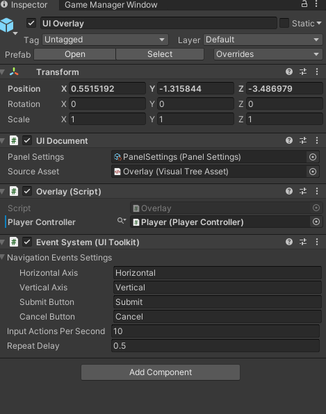
Add an empty game object to your scene and add UI Document to it. That will automatically add a UI Toolkit Event System Component as well. (If you are adding the Event System manually, be careful, there is another Event System and with that, it won't work. It must be the one from UI Toolkit).
Now we just need to set up the UI Document. First, lets create a PanelSettings asset in our project (right-click -> Create -> UI Toolkit -> Panel Settings Asset). Now we can assign it to our UI Document as well as the Source Asset, which will be our UXML file (the one generated from the UI Builder, we choose its name at the very beginning).
That's it! It will work as long as there is an object with:
- UI Document component- With PanelSettings asset (doesn't matter if you did not change anything there)
- With Source Asset set to your UXML
- Event System (the right one, from UI Toolkit)
And now the last and most important part - how do we make it do something?
We had a lot of problems with this part. First of all, we tried searching for how to bind properties directly to the UI values: let's say you have player health and a health indicator in your UI. If bound, when one would change, the other would automatically change as well! However, this feature currently works only when creating a Editor UI.
We can create the same behavior ourselves though, let me show you the code first (I created a new C# script inherited from MonoBehaviour and attached it to the same GameObject that has the UI Document).
public class Overlay : MonoBehaviour {
    private VisualElement root;
    private Slider rage;
    private VisualElement playerStateImage;


    public void OnEnable() {
        root = GetComponent<UIDocument>().rootVisualElement;

        rage = root.Q<Slider>("Rage");
        playerStateImage = root.Q<VisualElement>("PlayerStateImage");

    }

    private void Update() {
        rage.value = PlayerController.Rage;

        if (rage.value == 1) {
            playerStateImage.RemoveFromClassList("normal_player_state");
            playerStateImage.AddToClassList("rage_player_state");
        } else {
            playerStateImage.AddToClassList("normal_player_state");
            playerStateImage.RemoveFromClassList("rage_player_state");
        }
    }
}
What is the important part here?
- We can get the root element from the UI Document!
- With the root element, we can query it for any element from our UXML (in this case I found the slider and the visual element with the rage image).
- With the element - we can change its value.- if we keep changing it in Update, then we are reflecting the value from our game logic into our UI. It is the same as the binding - only one-sided.
- We can add or remove USS classes.
Actually, this example is a bit silly, because you would not change classes just to switch a background image (which is this case), luckily you can edit the styles of the element directly!
root.Q<VisualElement>("Photo").style.backgroundImage =
    new StyleBackground(Resources.Load<Sprite>("Portraits/FemalePhoto"));
For more info about the querying as well as the elements, I highly recommend the official documentation.
Ok, we have one last part left. The buttons. We of course want to click them and make something happen! For that, we can register a clickable callback. We can say what code will run every time the button is clicked. See this example (this code is run just once, in the Start function):
Button darkBomb = root.Q<Button>("DarkBomb");

darkBomb.clickable = new Clickable(() => {
    PlayerController.HandleSpellCast(Spell.DarkBomb, SpellType.Area);
  });
That's it! This is all the knowledge that was enough for me to create this simple yet functional UI. The spells buttons are clickable and when clicked, the HandleSpellCast function from our player is called. The slider slides and shows how much rage the player accumulated. The rage image changes when the slider reaches the end. Last but not least, the selected office worker (the top part with the photo and info) is shown when an NPC is selected in the game (I created a class that hides the whole section and I am toggling it on/off).
I hope this guide was helpful to you. I created it mainly because I was having so many problems putting all this information together, but I am glad I did and I learned it. I am sure I will be using UI Toolkit from now on forever, as I really love it. Thanks for reading!
Links from the article: