This is a side-by-side comparison of our pixel art from our upcoming game called BITGUN. These pictures are less than 3 months apart. In this post, I will show you our journey and describe the steps we took and what we were focusing on. The main secret of improving our art is simple though - keep working in small increments, improving one thing at a time, getting better at the process, and be consistent!
This is how we started - because both of us (we are a married couple, trying to go full-time indie) are programmers and not artists, we decided we will keep the art style minimal and sell the game on it being really fun, rather than pretty.
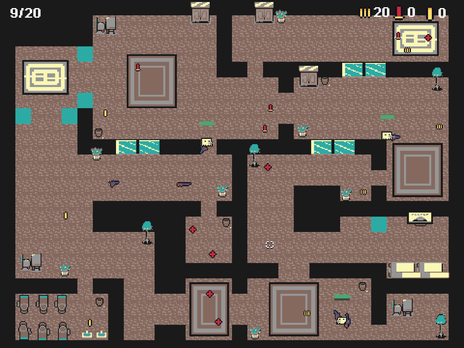
It did not take long and we started to feel more confident, thinking that maybe we can make the art a little bit prettier and most importantly with more details. We started to draw furniture. It actually didn’t look that bad when looking at one piece only, but when we put it together into a scene …. Well, we realized it is not that easy after all.
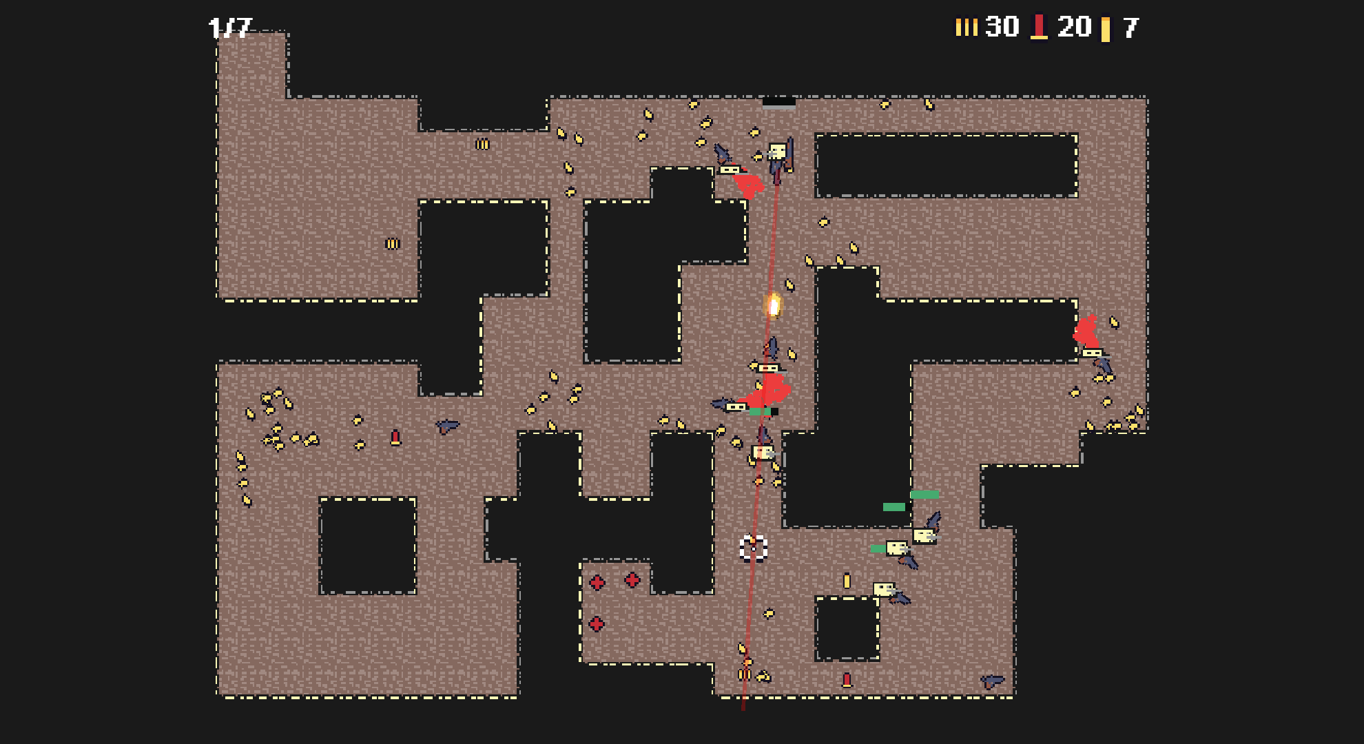
We went back to simple geometric design, without many props. We decided to focus on the tiles only and we drew some new floor tiles which added to the variety of the scene. We also decided on the color palette, which we are still using now and I believe it is a big part of our success, consistent color choice from the very beginning!
After tackling the tiles, we switched our attention to the player and the enemies. We ditched the old cartoonish characters and drew some more realistic ones. Well, actually we draw just one and use it both for the player and enemies because we figured that we will first find what works before spending more time in drawing alternatives of the same style. That was a good call.
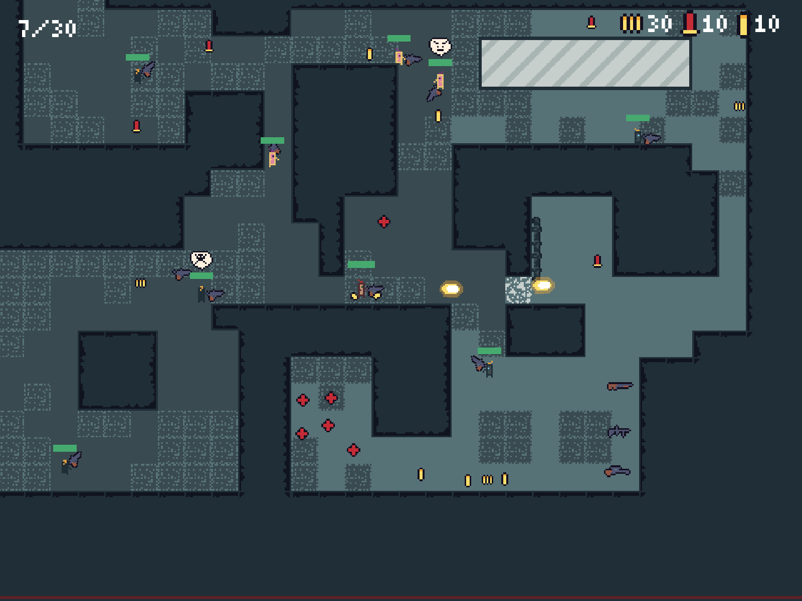
The next round of improvements focused on lights and effects. We also drew a “helmet” for the enemies - the idea was that we can have the same animation for both player and different types of enemies, but we would distinguish enemies just by giving them a unique look for the head, by overlaying a sprite over, similar to wearing a helmet.
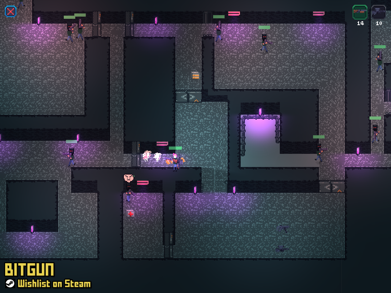
As you can see, we did not stick with this character for very long, but most importantly we made all the people smaller. It was also time to take another look at the tiles again and we added some lighter walls which make the scene pop and add some contrast.
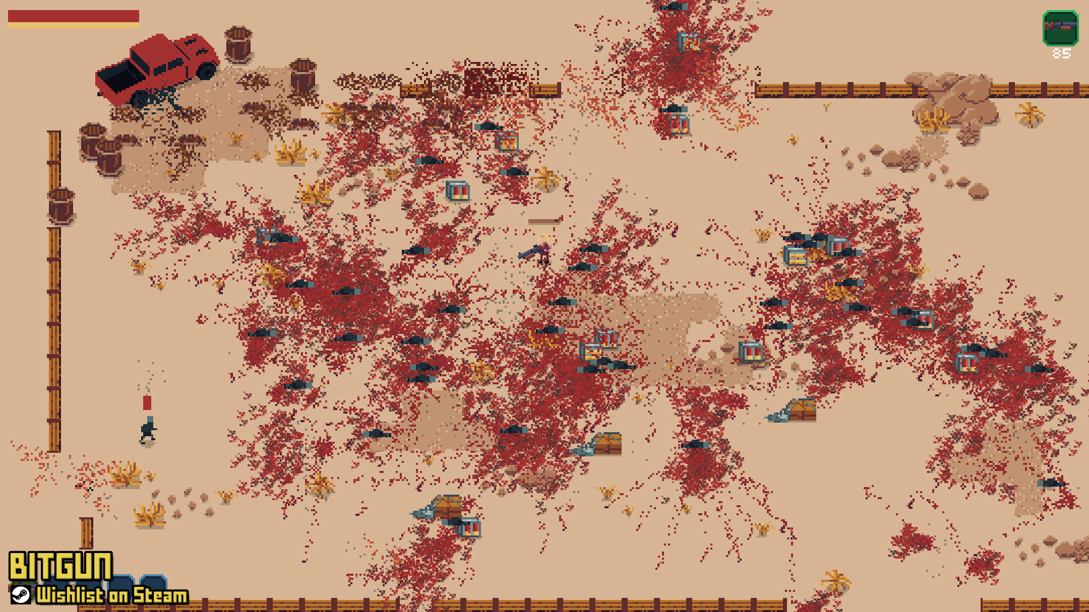
The last round of improvements circled back to effects, this time adding blood and also making the projectiles and bullet shells smaller!
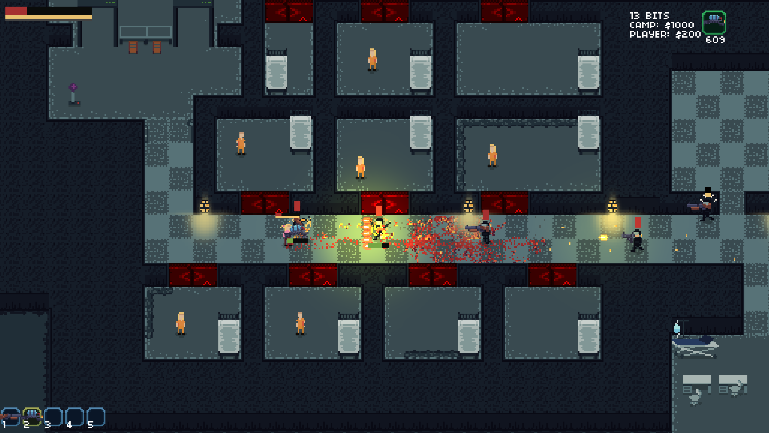
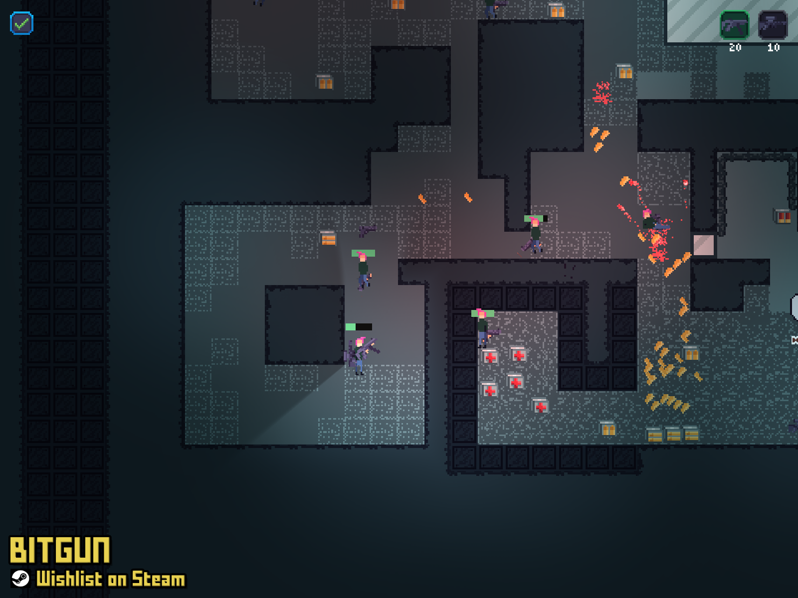
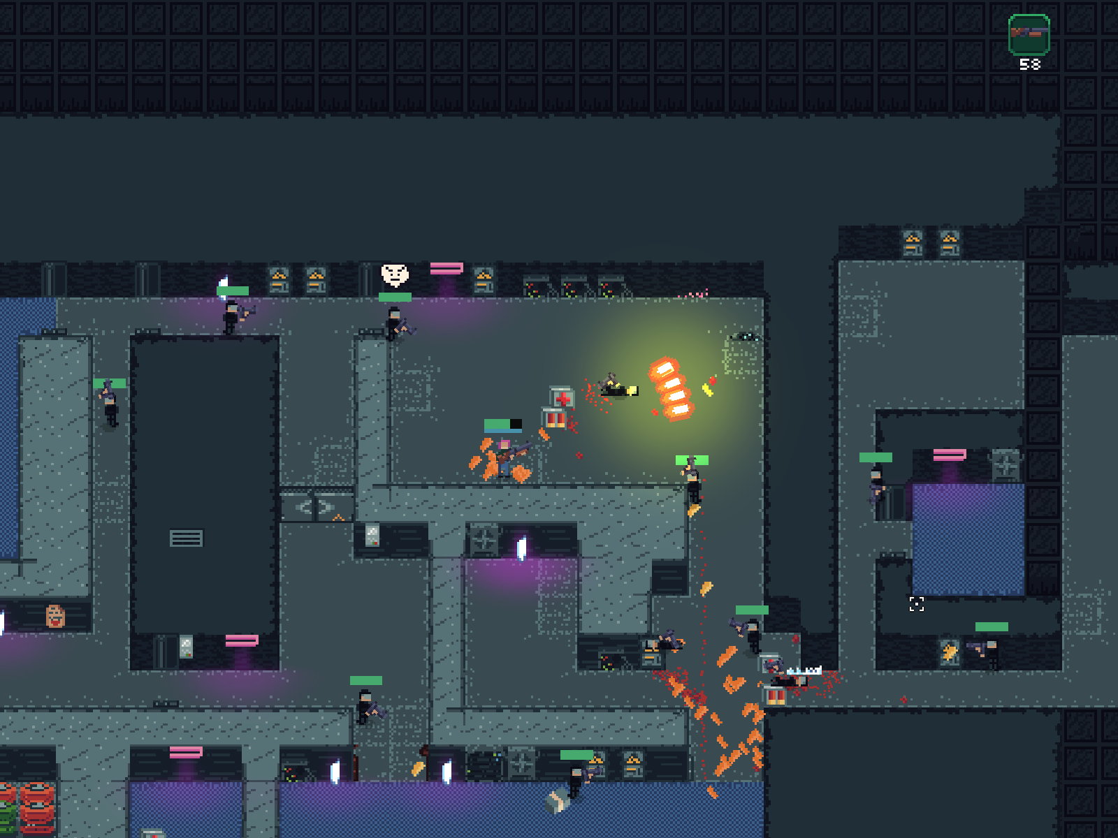
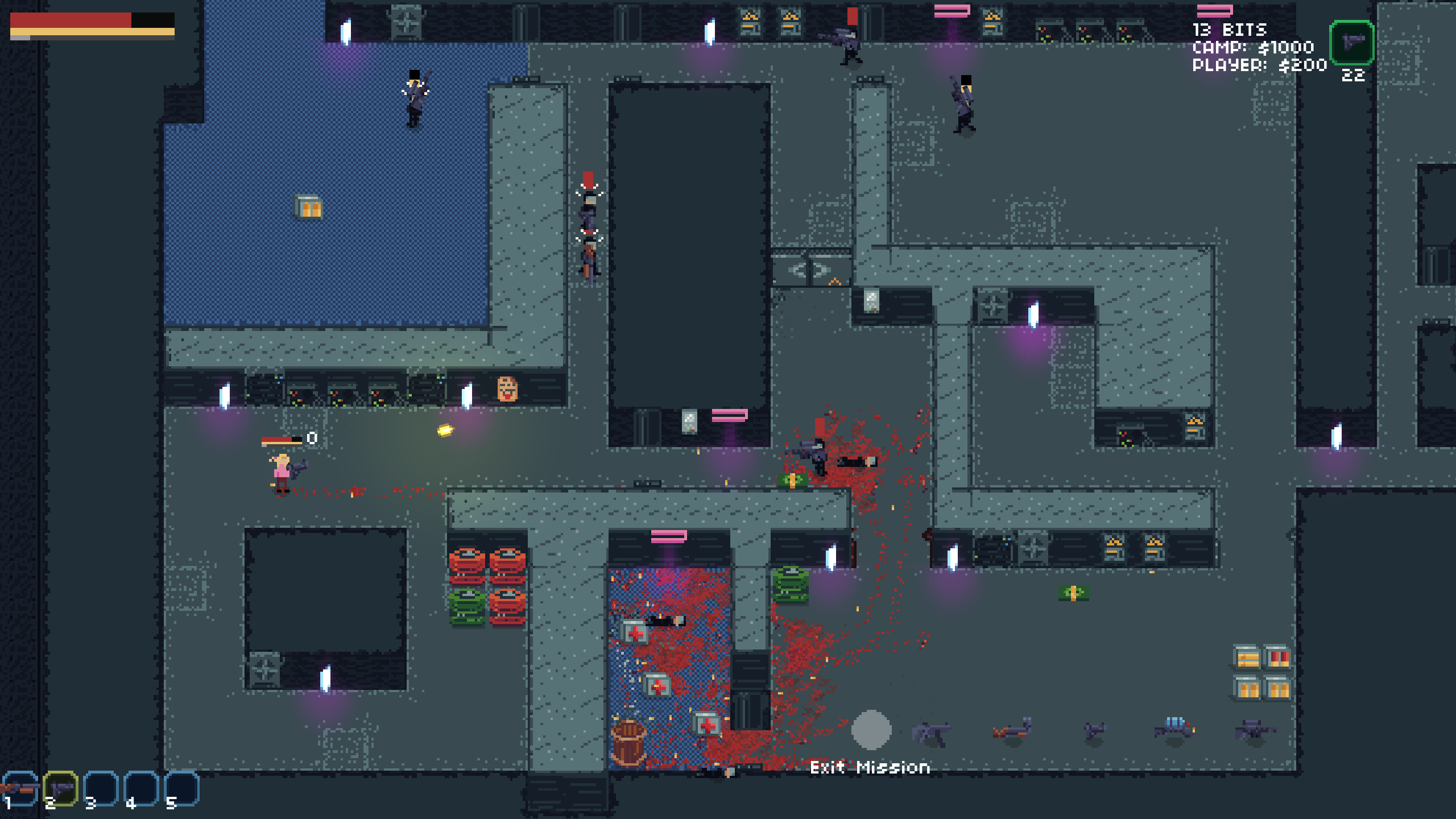
And here we are in the present! We are getting slightly more confident again, drawing some furniture.. But we learned our lessons and we are not trying to fill up the whole level and do everything at once, but instead, we are taking small steps and evaluate them as we go, consistently working on it and improving it one step at a time.
We will for sure continue to improve our pixel art, so if you are interested in our journey, you can wishlist BITGUN on Steam or follow us on Twitter at @LogLogGames.